


As online learning gains prominence in the K-12 education space, the rules for third party ed-tech solutions are catching up. My team at Ellipsis Education has been navigating these requirements, and in order to get our computer science curriculum to state-level adoption, accessibility (which I'll abbreviate as a11y) has been one of the biggest hurdles.
The US Department of Education's scoping requirements for software lay out the following:
"User interface components, as well as the content of platforms and applications, shall conform to Level A and Level AA Success Criteria and Conformance Requirements in WCAG 2.0" (via DoE)
These WCAG criteria cover everything from contrast ratios to keyboard controls, context for UI elements to logical web structure. As recently as a few months ago, our products weren't even at single-A level success criteria. Meeting these criteria has spurred major changes, both technically and in our processes. Here's an overview of some tips and takeaways from the past several months of accessibility work:
ARIA properties and accessible HTML stuff
At the start of this project, aria-label was the only accessibility property that I was familiar with, and I wasn't even using it correctly! Here are some tips on a11y HTML properties:
aria-label
- It's only for interactive elements, mainly buttons. Don't use it randomly throughout your codebase!
- It should be should describe what the element does, in a way that you'd actually read it. Plain, lower case, space-separated words are great.
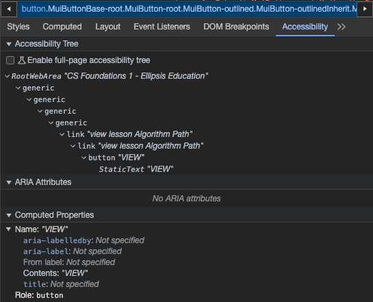
- Provide more context to an aria-label when more than one of an element exists on a page! If you have 10 different "View" buttons on a page, it may be confusing for a user to differentiate them otherwise.
aria-labelledby
- This property receives an id value of another DOM element, and uses its inner text or aria-label
- I've used this property to give a more meaningful label to an icon button or a generic button that reads "More", when another adjacent element has a more descriptive label.
tab-index
- This is very important property for accessibility, because it manually determines whether a keyboard can be used to focus on the element
- A tab-index of 0 makes an element keyboard focusable
- A tab-index of -1 makes an element unable to be focused by a keyboard. This is useful when you have nested elements, like an icon or text within a button, and you don't want the user to be able to select them individually.
Here's an example of tab-index usage, where the Link component should be keyboard focusable, but not the nested button:
role
- There are a ton of options for this property, for when an element needs more specificity, or behaves in a way that requires accessibility aid
- I've used it for defining a React tab controller component, where the parent component needed a tablist role, and the tabs needed a tab role. This helped keyboard controls know how to handle interacting with the component.
aria-current
- This property helps mark which element in a grouping of elements is selected or active
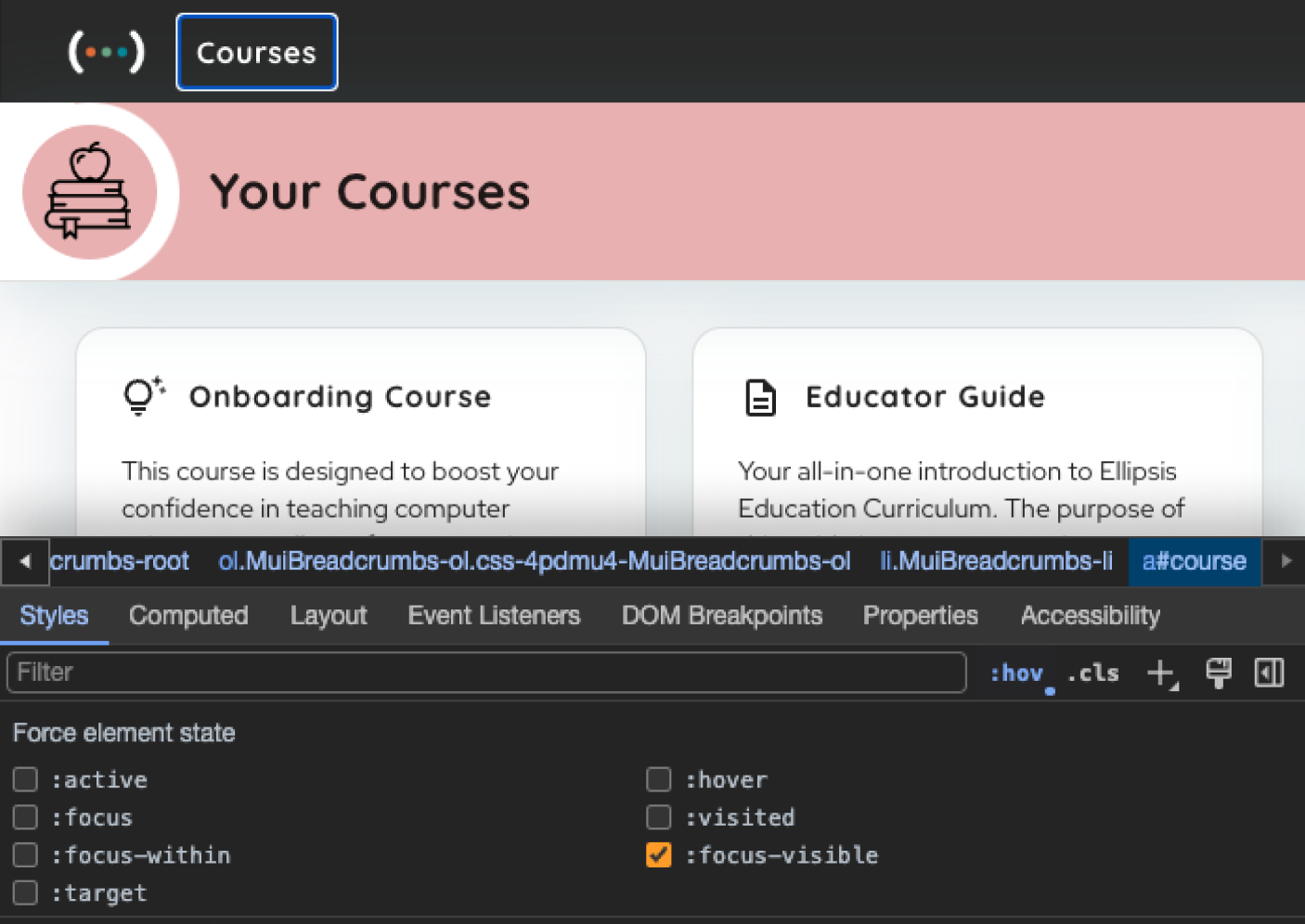
- I've used this property in the context of a Breadcrumb navigation component, where aria-current is 'true' for the element that represents the current page.
aria-pressed
- Helps to mark if an element has been toggled
- I've used this for a password input that has an icon button to toggle showing the password as dots, or text
aria-sort
- This property should be used on a table header's cell and have a value of either 'ascending' or 'descending', this is especially important because icons are a common way to display how a table is currently sorted
MUI
Using React's MUI component library has pretty solid support for web accessibility, and it's clear that their library was built with it in mind. Their examples include aria props, and components even have sections devoted to tips on how to them accessible. It's been an excellent foundation, but you'll still need to understand and utilize accessibility properties and best practices.
CSS
To indicate which element on the screen is currently focused by the keyboard, you'll probably need some custom styles. I used this class in many places, by using the outline property (which doesn't change the size of the element when applied and unapplied) and -webkit-focus-ring-color to display a blue-and-white outline on Chrome.
Keyboard Navigation
To get started with keyboard navigation, here are the keyboard commands that you'll need:
- Tab: navigates forward in your DOM tree
- Shift+Tab: navigates backward in your DOM tree
- Enter: selects an element
- Esc: dismisses an element/modal
- Arrow keys: navigate within certain groupings of elements, like tab lists or menus
Chrome Dev Tools' Accessibility Viewer
Buried in Chrome Dev Tools' Elements tab is an accessibility viewer that shows you how your aria and other a11y properties are shaking out, and it's super helpful.
You should also get used to toggling the focus-visible selector in Chrome Dev Tools, which is applying the above focusVisible style.
Improving accessibility will improve your business
Your company probably has a process or deliverable that doesn't make any sense! We sure did. At Ellipsis, all of our thousands of lesson plans and curriculum resources have been Google Docs. If we wanted to change the font size of a title, or update the look of the vocabulary section, we’d need to manually edit every single one of ’em! All of our lesson plans have existed as remote islands of Computer Science goodness – until now. Since any PDF or iframe version of a Google Doc can't meet the majority of WCAG criteria, we needed to explore other options for delivering our curricula.
We went with Sanity as a custom CMS, so that we could write our lesson plans and render them in React with full control of web accessibility criteria. This improved our product in many ways: every document's design was now "change once, update everywhere", documents could share relationships to content like supplementals and vocab, and all lesson plan content now shared a common, enforced structure. Focusing on a11y revealed and led to the resolution of some key inefficiencies for our business, and I think that's transferrable to other companies.
Building for accessibility makes you a better engineer
I've spent my career at small startups that lack the bandwidth or urgency to give a11y the attention that it deserves. Now that I've seen our product pre and post a11y remediation, I won't be able to build a web app the same way. This process has put me in the shoes of a variety of impaired users: including those with physical, vision, or cognitive disabilities. Each of which intersect with our two primary end users: educators and students. Understanding users that approach technology differently than you has led me think more critically about design and development.


